Effective Billboard Design
The Dos and Don'ts of Effective Design & Copy
Introduction
Billboard advertising remains a powerful tool in the marketer's arsenal, capable of capturing the attention of a wide audience. However, designing an effective billboard requires careful consideration and strategic thinking.
In this blog post, we will explore the dos and don'ts of effective billboard design. Whether you're a business owner, marketer, or designer, these guidelines will help you create impactful billboards that drive engagement, brand awareness, and ultimately, business success.

Dos of Effective Billboard Design:
1. Do Keep It Simple
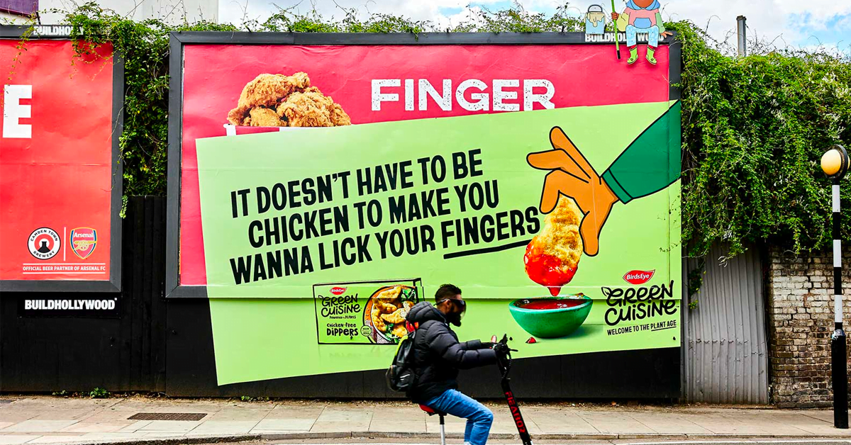
One of the cardinal rules of billboard design is to keep it simple. Billboards are meant to be viewed and understood quickly, often by passing motorists. Therefore, your message should be concise and easy to comprehend at a glance.
Use minimal text and focus on a single key message. Consider using bold and large fonts for improved readability from a distance. Simplicity is key to grabbing attention and leaving a lasting impression.
2. Do Prioritise Visibility
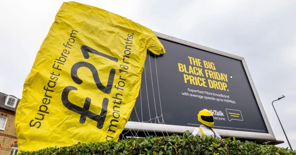
Visibility is paramount in billboard design. Ensure that your billboard is highly visible, even from a distance. Choose high-contrast colours combinations to make your message stand out. Use vibrant colours against a contrasting background to increase visibility.
Consider the environment where your billboard will be placed and select colours that will make it pop. Additionally, optimise the size of your text and images to be legible and clear from afar.
3. Do Include a Strong Call-to-Action
A compelling call-to-action (CTA) is essential for driving desired actions from viewers. Clearly state what you want the audience to do, whether it's visiting your website, calling a phone number, or visiting your store.
Use action-oriented language and place the CTA in a prominent position on the billboard. Make it easy for viewers to understand how they can engage with your brand and encourage them to take immediate action.
You can use ChatGPT to help write call to actions and further copy.
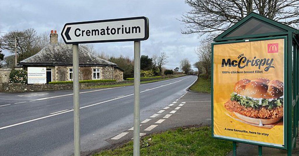
4. Do Consider the Location
Understanding the location where your billboard will be displayed is crucial for effective design. Take into account the surrounding environment, such as the traffic flow, viewing distance, and demographics of the area.
Adapt your design to suit the location and target audience. For example, if your target audience consists of commuters stuck in traffic, consider incorporating entertaining or informative elements to engage them during their daily commute.
5. Do Ensure Brand Consistency
Consistency in branding helps build recognition and trust. Incorporate your brand's visual identity into the billboard design by using consistent colours, fonts, and imagery.
Maintain a cohesive brand voice and messaging that aligns with your overall marketing strategy. Consistency across various advertising channels reinforces brand recall and helps create a lasting impression on the audience.

Don'ts of Effective Billboard Design:
1. Don't Clutter The Design
One of the biggest mistakes in billboard design is overcrowding the space with too much information.
Remember, billboards are meant to be seen and understood quickly, so avoid cluttering the design with excessive text, multiple images, or unnecessary elements. Stick to a single, impactful message and ensure that it is easily readable from a distance.
Clear Channel have a number of artwork templates on their website which you can use to test your designs.
2. Don't Use Small Fonts
The readability of your billboard is paramount. Using small fonts can make it difficult for people to read your message, especially when they're driving or passing by quickly.
Choose bold, large fonts that are easy to read from a distance. Test the legibility of your fonts by viewing them from various distances to ensure maximum readability.
3. Don't Overlook Contrast and Colour choices
The colours and contrast in your billboard design play a significant role in grabbing attention. Avoid using colours that blend into the background or fail to create a strong visual impact.
Opt for high contrast colour combinations that make your message stand out. Use complementary colours strategically to draw attention to specific elements or create a sense of harmony in the overall design.
Conclusion
Designing an effective billboard requires careful consideration of various factors, including simplicity, visual impact, readability, and strategic use of elements.
By following the dos and avoiding the don'ts of billboard design, you can create a compelling and memorable advertisement that captures attention and delivers your message effectively.
Remember to keep your design simple and focused, using high-quality images that resonate with your audience. Choose legible fonts, large enough to be read from a distance, and ensure that your colour choices and contrast create a strong visual impact.
Avoid clutter, complex visuals, and excessive text that can hinder comprehension. Strive for a clear, concise, and memorable message that leaves a lasting impression.
Regularly evaluate the effectiveness of your billboard design by tracking metrics such as brand recognition, engagement, and response rates. Make adjustments and improvements as needed to optimise the impact of your billboard campaigns.
Remember
With a thoughtful and strategic approach to billboard design, you can create powerful advertising messages that reach a wide audience and generate the desired impact for your brand or business.
Related Articles & Insights
Quick Navigation
Frequently Asked Questions About Billboard Advertising
We understand that billboard advertising can be a powerful way to reach a large and diverse audience, but it can also be confusing and overwhelming. That's why we've put together this page to answer some of the most common questions about billboard advertising.
General FAQs
Get In Touch
If you have any further questions about billboard advertising, please don't hesitate to contact us. We're always here to help!
